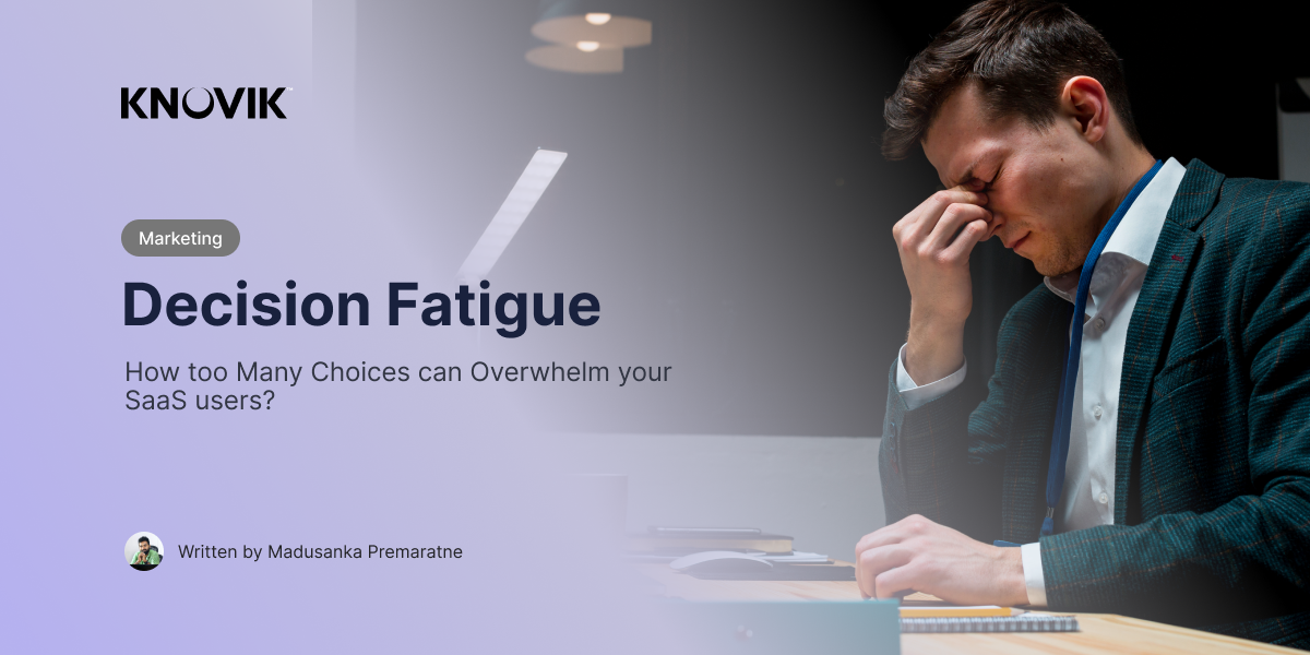
Decision Fatigue - How too many Choices can Harm Products?
As the founder of Knovik, where we design and develop applications that solve real-world problems, I’ve seen firsthand how critical it is to make our products user-friendly. One of the biggest challenges SaaS companies face today is decision fatigue, that feeling of mental exhaustion when we’re bombarded with too many choices.
At Knovik, we know the importance of simplifying the decision-making process for our users. The easier it is for someone to pick a plan, feature, or solution, the more likely they are to convert and stick around. But when users are overloaded with options, their brains get tired, and that’s when things go south fast.
In this post, I want to share what decision fatigue is, why it happens, and how we, as SaaS creators, can design our apps to avoid it. Let’s make sure our users don’t get overwhelmed by too many choices.
What Is Decision Fatigue?
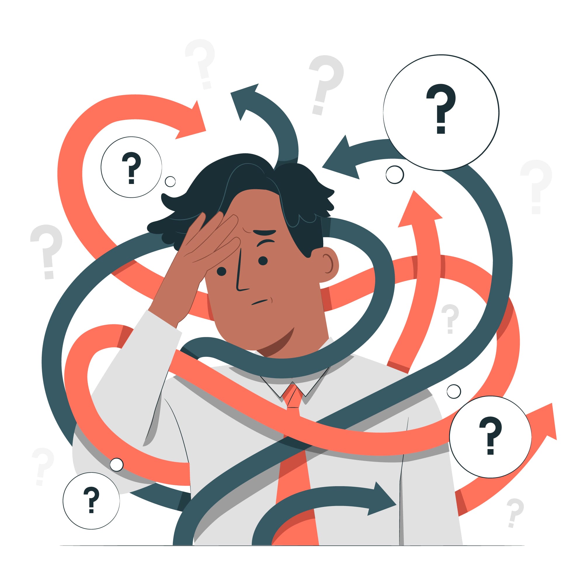
Decision fatigue is what happens when we’ve made so many choices that our brains get tired, and we start making worse decisions. It’s why you might feel overwhelmed at the end of a long day or why your users feel stuck when faced with too many options in your app. They either
- Pick something quickly and regret it later, or
- Put off the decision altogether, maybe even closing your app in frustration.
Sound familiar? It’s something I’ve seen many times, and it’s especially common in SaaS products.
How Does Decision Fatigue Affect SaaS Users?
Let me give you two examples.
Example 1: The 10-Solution App
Imagine you’re using an app that gives you more than 10 solutions to solve the same problem. While variety is great, having so many options can easily overwhelm a user. I’ve seen this happen in some of our earlier versions of Knovik’s products. Here’s what typically happens,
- Paralysis by analysis - The user spends too much time comparing each option, feeling stuck and unsure.
- Rushed choices - They might pick something quickly, just to get the decision over with, and end up unsatisfied with their choice.
- Abandonment - Worst case? They get frustrated and leave the app without making a decision at all.
More options might seem like a good thing, but in reality, it can cause users to freeze up. It’s like going to a restaurant with a menu the size of a book—you’re so overwhelmed by choices that you can’t even decide what to eat!
Example 2: The 2-Solution App
Now, imagine another app that offers just two solutions to solve the same problem. It’s straightforward. The user can easily weigh the pros and cons, make a quick decision, and move forward. They feel confident, not overwhelmed.
At Knovik, we’ve found that simplicity wins every time. When you give users just a couple of clear options, they’re less likely to experience decision fatigue. They’re more likely to make a choice they’re happy with, and they stick with your product longer.
Why Does Decision Fatigue Happen?
Here’s the reality, our brains can only handle so many decisions before they start to wear out. As entrepreneurs and SaaS builders, we often overload our users without even realizing it.
Before we dive into why we often face decision fatigue, I want to ask you a very simple question: How many friends do you have? And more importantly, how many active relationships can you realistically manage?
By thinking about this, you'll start to realize that the human brain has a cognitive limit on everything, including how many decisions we can handle. Just like relationships, there’s a point where our brains simply can’t juggle any more choices.
So here are the main reasons behind "Decision Fatigue" for SaaS Products.
- Cognitive Overload
Every time a user has to choose between different plans, features, or solutions, they burn mental energy. The more choices they face, the quicker they tire out, leading to poor decisions or even giving up entirely. - Too Many Features
It’s tempting to cram a lot of functionality into your product to make it “feature-rich.” But when you offer too many solutions that basically do the same thing, users get lost. Trust me, I’ve made this mistake before. - Lack of Guidance
Without clear guidance or recommendations, users feel like they’re navigating a maze. If everything looks equally important, they won’t know where to start. This uncertainty just adds to their mental fatigue.
How to Combat Decision Fatigue in SaaS?
Here’s what I’ve learned at Knovik about helping users avoid decision fatigue:
- Simplify Choices
You don’t need to offer 10 different solutions to the same problem. Simplify it. Offering just two or three well-thought-out options can make all the difference. Remember, less is more. When users are presented with fewer decisions, they’ll make faster, more confident choices. - Segment Features into Categories
If your app has multiple features or solutions, group them into categories that make sense. For example, split your offerings into Software and Hardware solutions, so users aren’t comparing apples to oranges. This gives users clarity and reduces cognitive overload. - Use Recommendations
Sometimes users just want a little nudge in the right direction. Provide a “recommended” option or set a default that fits most users. This removes the burden of decision-making and guides them toward a choice that works for them. - Provide Clear Comparisons
If you do offer multiple solutions, make it easy for users to compare them. A simple side-by-side comparison chart can help them quickly see which option best fits their needs, without having to think too hard about it. - Streamline the User Journey
Don’t make your users jump through hoops. If they’ve made a decision, keep the process simple and straightforward. For example, don’t redirect them to a completely different website after they click “purchase”, that’s a surefire way to increase their anxiety and cause second thoughts.
The Impact of Decision Fatigue on Your Business
Here’s why decision fatigue matters so much for your bottom line.
- Lower conversions - Users who are overwhelmed by choices often give up before completing a purchase.
- Higher churn - If they rush through a decision and end up dissatisfied, they’re more likely to leave.
- Missed opportunities - Simplifying choices helps guide users to the best solution for their needs, improving satisfaction and retention.
In my experience, offering too many solutions can actually hurt your business. When you overwhelm users, you lose conversions and create more churn.
In my experience, one of our apps used to generate $10 for every 100 users we brought in. But after a revamp, we managed to attract over 1,500 users. Yet, the transactions just didn’t come through like they did before. The key issue? We made things too complicated. By simplifying the decision-making process, you can boost user satisfaction and loyalty, which ultimately leads to more conversions.
Final Thoughts, Keep It Simple, Keep Them Happy
As a SaaS founder, I know how tempting it is to load your product with features and options. You want to solve all your users’ problems, right? But too many choices can actually create problems, leading to decision fatigue and frustrated users.
At Knovik, we’ve learned that simplicity is key. Fewer, clearer options lead to better user experiences, higher conversions, and lower churn. So, the next time you’re adding a new feature or pricing plan, ask yourself: Are we making it easier for users to decide, or are we adding to their fatigue?
Remember, your users want a solution, not a puzzle. Give them clarity, and they’ll thank you for it.
Visit my website and join with me as a business partner — Madusanka Premaratne — Entreprenuer | Founder & CEO at Knovik | Director of OECSL
Join 20,000+ Followers on Facebook — Madusanka Premaratne | Facebook
Join 4,500+ Followers on LinkedIn — Madusanka Premaratne — Venture Capitalist | LinkedIn
Join 2,000+ Followers on Instagram — Madusanka Premaratne (@madusankapremaratne)